PROBLEM
During the last 9 months, the social and economic landscape of America has changed vastly in response to the novel Coronavirus.
Businesses have had to change their protocols in order to stay open, and those who could not have since shut down. In addition, individuals must also change their behaviour in order to promote their safety and the safety of others.
Due to the closure of most indoor entertainment businesses, movie theaters have suffered.
However, movie-goers have rediscovered another way to see new films within the local and national regulations. Drive-Ins have been growing in popularity as an alternative to theaters, but there are still COVID-19 risks.
OUR SOLUTION
Through our research of Drive-In theaters, we discovered multiple points of interaction (including food and ticket sales) that could easily be done remotely.
With the Popcorn mobile application, it is possible to attend a Drive-In movie with next to zero physical contact with anyone outside of your own vehicle. Our app will allow you to view available films, book a spot/buy tickets, use GPS to find the theater, control your audio from your phone or car speaker, order snacks directly to your vehicle, locate open restrooms and so much more.
Research & Development
Exploratory Research
During this phase of our design research, we used service design techniques to construct several different kinds of maps that would help us organize our approach to creating the improved Drive-In experience.
Stakeholder Maps
The first maps we creates were our stakeholder maps, which are generally visual representations of key constituents of a design project.
They are meant to provide a visual reference point for the design team, setting the stage for further user-centered research and design development.
Territory Maps
Our territory maps are basically an extension of our stakeholder maps, but with the addition of trends, themes, and ideas that your team found important to the topic at hand.
The goal is to lay out the entire problem landscape and “define its boundaries”. Since the creation of territory maps draws on the preconceptions and knowledge of team members, they contribute to the creation of a shared vision.
Personas
We created Personas in order to represent and interact with three particular groups of people who would be affected by our service (customer, employee, owner).
Journey Maps
Next we created journey maps for our customer, employee, and business owner, meant to provide a vivid, structured visualization of their user experience.
Research Plan and Goals
Primary Research & Secondary Research
Participant Observation – was a service design research method utilized by a team member who went on a “field study” to a local drive-in and reported their experience.
Questionnaires – Surveys were sent out asking about what drive-ins were like pre-COVID for both customers and employees. Luckily, design team members happened to know friends and family who both worked in the business and had experienced it before and after the pandemic.
Directed Storytelling – was another service design research method we used. A former customer was asked to describe their pre-COVID experiences at the drive-in movie theater.
Questionnaires & Responses


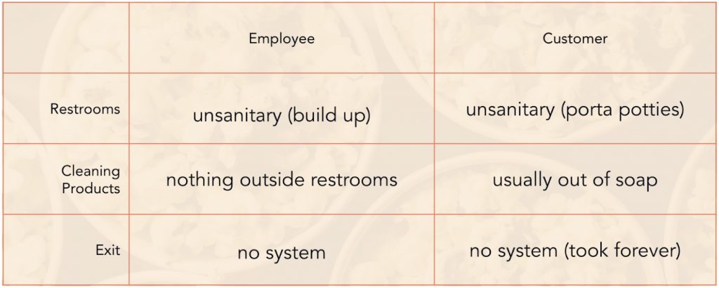
PRE-COVID QUESTIONNAIRE COMPARISON
QUESTIONNAIRES WAS ONE OF OUR PRIMARY TOOLS FOR COLLECTING SURVEY INFORMATION. WE DID OUR BEST TO WORD QUESTIONS CAREFULLY, SO AS TO SECURE GOOD RESPONSES. QUESTIONNAIRES HELPED US GATHER INFORMATION ABOUT THEIR FEELINGS ABOUT CUSTOMER AND EMPLOYEE DRIVE-IN EXPERIENCES.
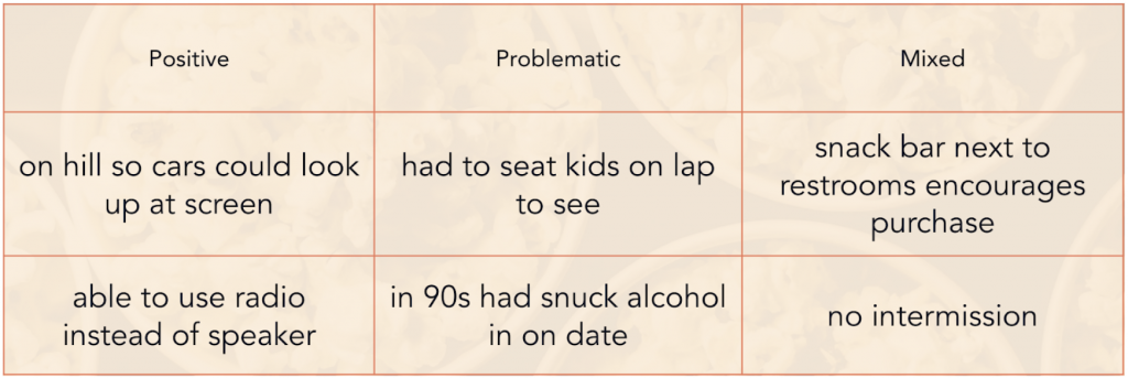
DIRECTED STORYTELLING REVIEW
Directed storytelling came in handy for our primary research methods. One of our teammates parents was willing to participate and share their lived experiences using some narrative conversation prompts we developed as a team.
SOME RESEARCH FINDINGS
Pre-covid customers had issues with restrooms, a lack of available cleaning products, and exiting.
There were also no systems for parking, so customers picked their spots based on visibility.
The things sanitized the most by employees were the popcorn machines, floors, and counters.
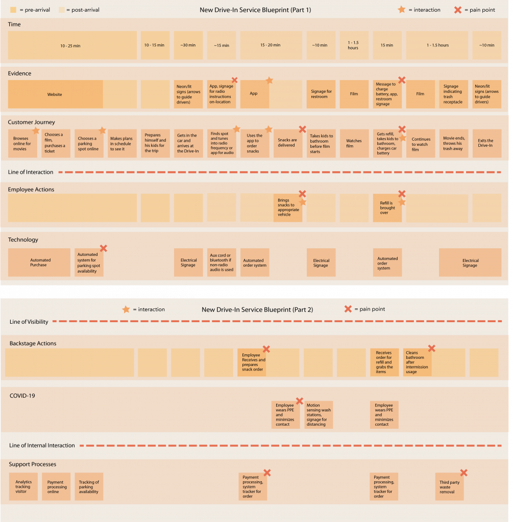
SERVICE BLUEPRINT
We created our service blueprints in order to specify and detail each individual aspect of our service.
This visual schematic (to the right) incorporates the perspectives of both the user (customer Jacob), the service provider (our Drive-In), and other relevant parties (support processes such as payment processing and waste removal services).
We made sure to include paint points, touch points, and shade the pre-customer-arrival and post-customer-arrival sections in different colors.
SCENARIO VIDEOS:
PRE-COVID, REGULAR MOVIE THEATER EXPERIENCE
POST-COVID, DRIVE-IN THEATER EXPERIENCE
Illustrations by David Park & Basil Johnson
Script & Audio by Anne Chamberlain
Edited by Edgar Cisneros
Learnings
PROJECT TAKEAWAYS
I came away from this project with a new appreciation for service design, and how intricately complex a service can be from start to finish.
We learned that combining two different methods of visualization might be helpful in theory but can overcomplicate things.
While I had a basic understanding of service design prior to this experience, I didn’t realize how flexible service design can be in that there are infinite tools one might use to research and bring a service to fruition.
In retrospect, we could have addressed some of the issues that came up in our research like exiting the drive-in and bathrooms. We also should have made less assumptions throughout the process.
CHALLENGES
We struggled from time to time with mitigating our teamwork evenly so that each member could contribute. The online platform sometimes made it difficult to work together, especially for certain exploratory research methods, and times when we were creating maps or charts in InDesign which is not inherently collaborative.
We noted at the end that a lot of our work was based off our own experiences and assumptions about the service. We should have maybe conducted heavier desk research earlier on in the process to reduce this, but it is difficult to find sound academic papers or statistics on very contemporary topics (like COVID).
It was also a little bit difficult to find informations for primary research during a pandemic.
Popcorn Mobile Application
This is the login home page of our mobile application prototype. It incorporates our logo with the Harlow Solid Italic type, and retains the red/yellow/white color palette in the buttons, which use the typeface Theater Bold.
MY ROLE
Facilitator – Kept everyone on task and delegated tasks to the most capable members of the team depending on skill set.
Organizer – I helped keep the drive organized and made sure that the process was moving along on schedule. I also turned our drafts in on the class drive.
Designer – I was responsible for logos/branding, scripts, and design deliverables throughout. If we had a second semester to develop our service further, I would have worked on wireframes & app development next.
Scheduler – I managed scheduling for our group, and made sure that we were meeting regularly, outside of class as well to ensure progress in this difficult remote semester.
BRANDING & MERCH
We settled on our team name, “Popcorn” early in the semester. I think if we were to re-work the name and logo, I might call it “PopCar” or “PopCarn” instead.
The logo and branding I created aims to indicate a popcorn bucket (something we all agreed symbolizes ‘The Movies’ to us), with the golden popcorn in the top being modeled after a Volkswagen Bug. The idea was to bring emulate both cars and movies, and so– the Drive-In theater.
Duration:
Fall 2020
August 24 – December 14
Online/Remote
Team Members
Anne Chamberlain, Edgar Cisneros, Basil Johnson, David Park