
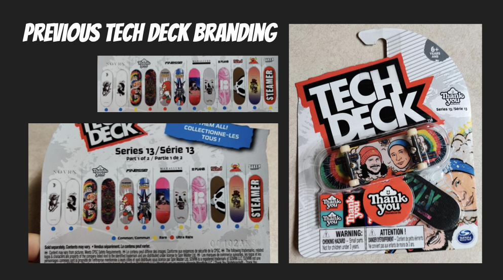
Problem
Rebrand an existing and historically gendered toy, using gender neutral typographic elements and color.
Solution
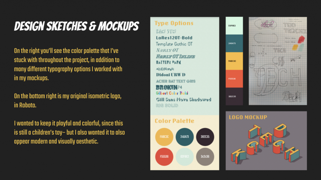
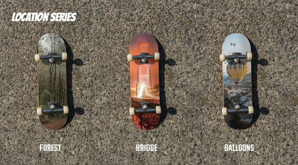
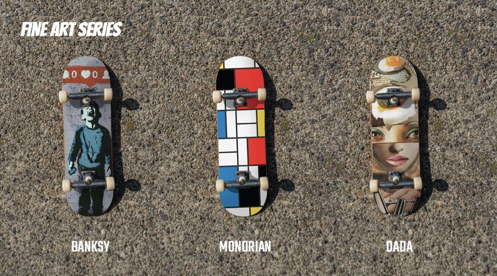
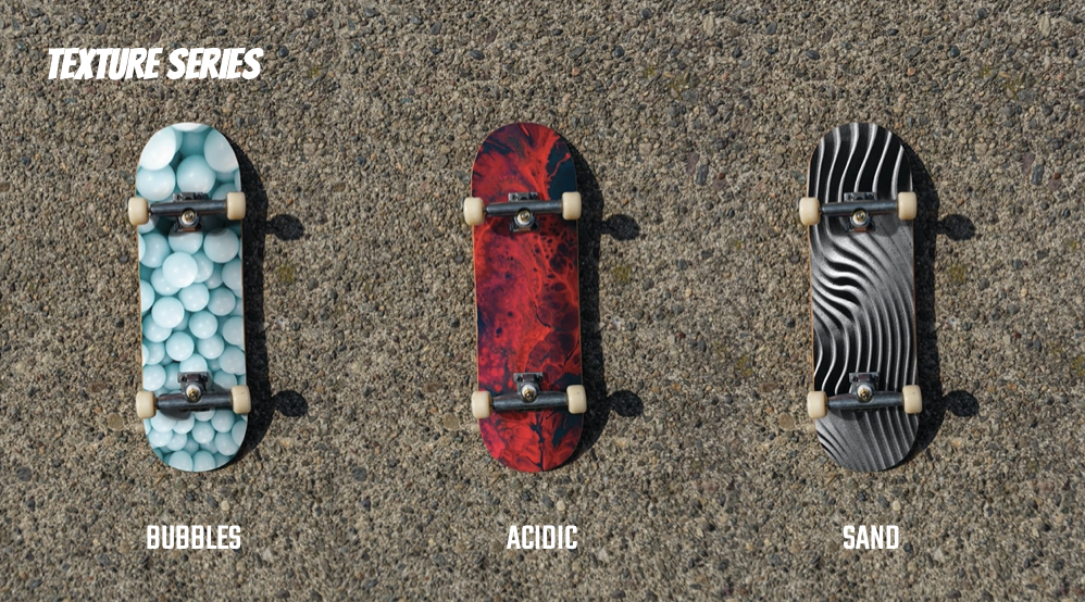
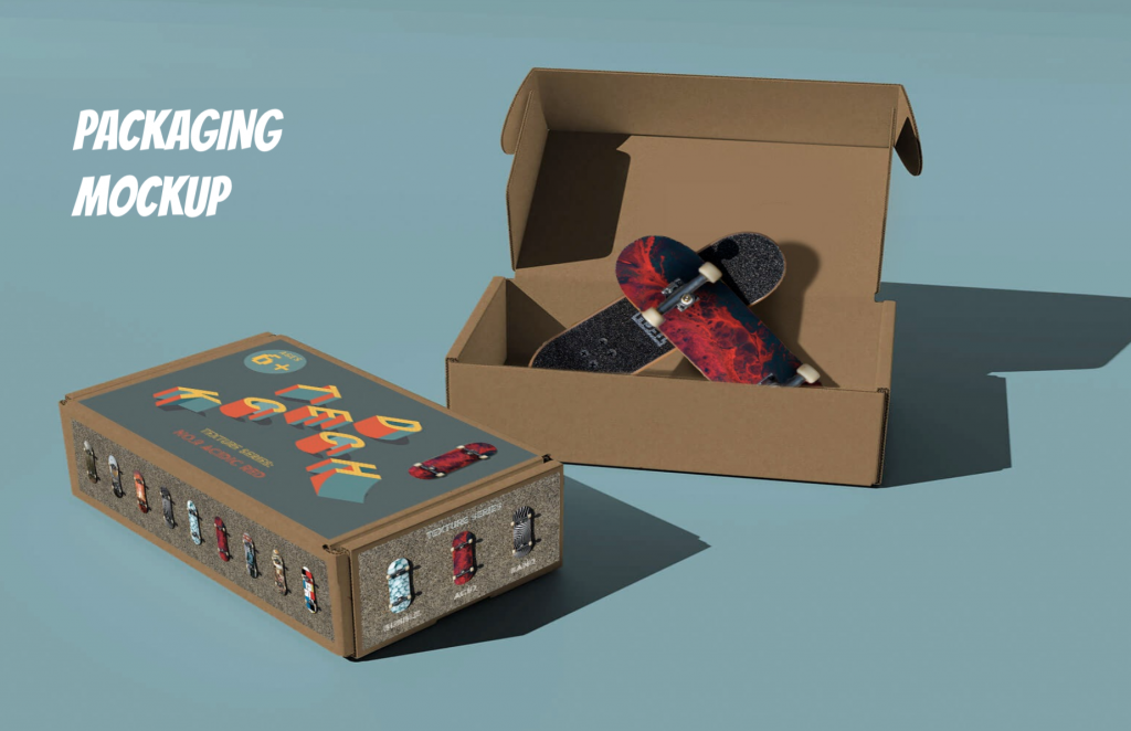
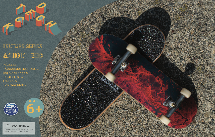
The aim of this project was to demystify the notion of classically gendered toys with typography, color and shape. Extensive type exploration has revealed how typefaces themselves contribute to the identity and direction of a brand. I decided to experiment with a isometric type for my logo, featuring bright colors overlaid with various textures and patterns, and slightly rounded edges to complete the look. The “H”, in “Tech” is reminiscent of a feature you might see at a skatepark. I have created a new style guide, including packaging, logos and a series of board designs based on abstract texture.
By redesigning Tech Deck so that it is less gendered, I hope to open the doors to children interested in skating, who may not feel as though they identify with one specific gender or another. This of course will not redesign skate culture– but I hope that by exposing the underlying sociocultural constructs of this particularly gendered toy, I might make one small facet of skate culture a little more accessible and tempting to all children, regardless of gender.
Programs
Photoshop, Illustrator